Design study · Air quality management district · California
Four jobs first, everything else behind them
An air district redesign concept that puts smoke advisories, burn-day status, permits and complaints, and grants ahead of the org chart — and deliberately ships no AI.
Working redesign prototype prepared as part of the June 4, 2026 Website Redesign & Development Services proposal. Not the live District website.
- Special district website
- Live air quality data
- Burn-day status
- Grant comparison
- Spanish pages
- Accessibility
Yolo-Solano Air Quality Management District — open the working site
Case study overview
The problem
An air district does four unrelated things: it regulates stationary pollution sources, runs incentive programs that move real money, tells residents when it is safe to go outside, and says whether you can burn today. Those audiences share almost nothing. A department-oriented menu — the default for a special district — serves the staff org chart and leaves a resident during a wildfire hunting for an air-quality number that should have been the first thing on the screen.
The approach
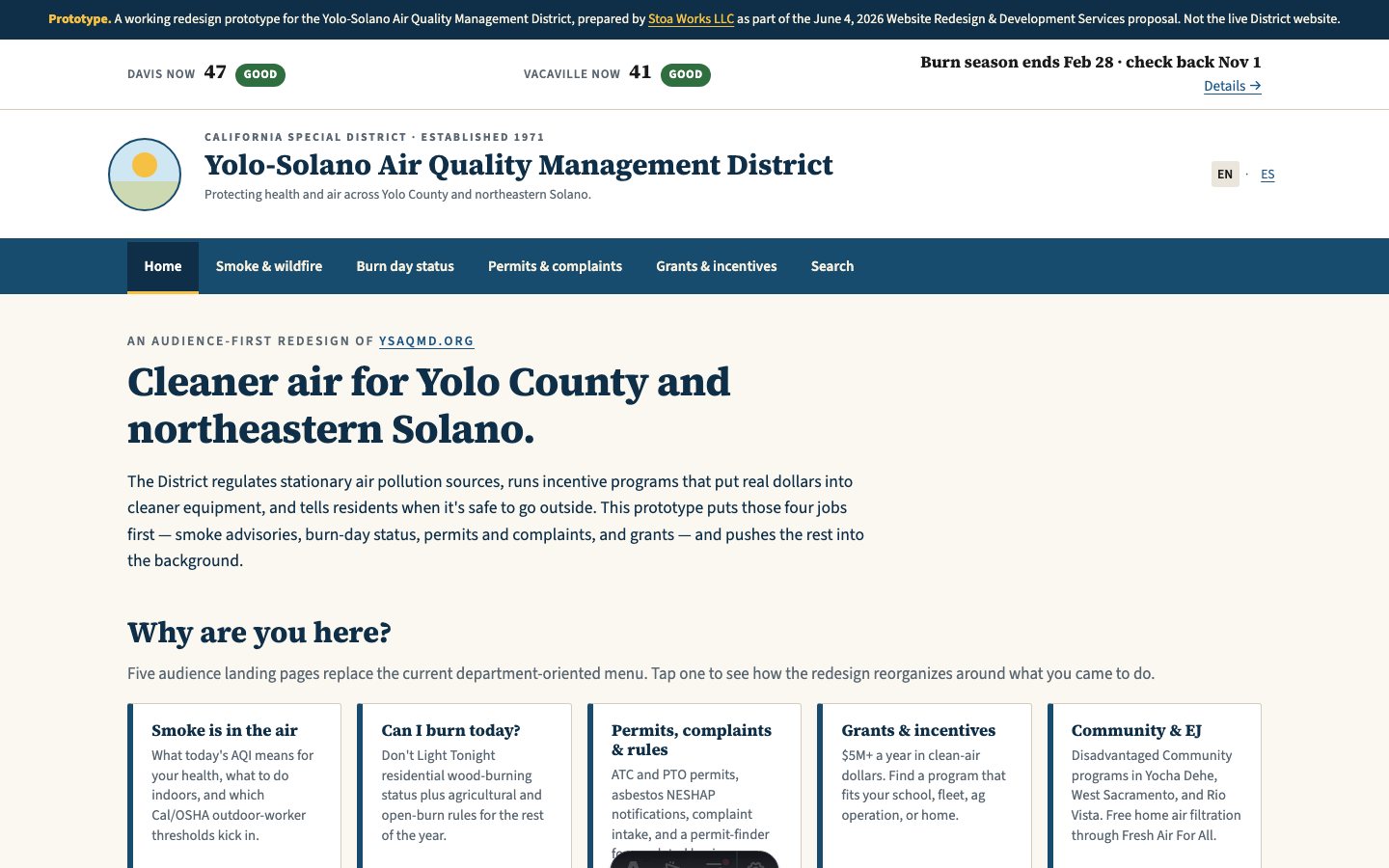
Five audience landing pages replace the department menu, each answering a why-are-you-here rather than naming a division: smoke is in the air, can I burn today, permits and complaints, grants and incentives, community and environmental justice. Today's air appears at a glance with live readings for Davis and Vacaville and the Don't Light Tonight burn status, because those are perishable and the rest of the site is not. The grant surface compares programs side by side rather than listing them, since the district moves about $5 million a year and the hard part for an applicant is knowing which program fits. Spanish runs as real pages, not a widget. The site also explains, on the page, why it uses no AI — a deliberate choice for an agency whose answers carry health and legal weight.
The result
Twenty routes covering air quality, burn status, permits, complaints, grants, forms, agendas, subscriptions, and search, with Spanish counterparts and a documented accessibility comparison against the current site.
Have something similar in mind?
Need a civic tool with this shape?
Stoa designs and ships resident-facing tools, internal workflows, and public service interfaces that stay fast, legible, and accessible from day one.