Design study · Golf microsite · Illinois
Three courses, one community, one phone screen
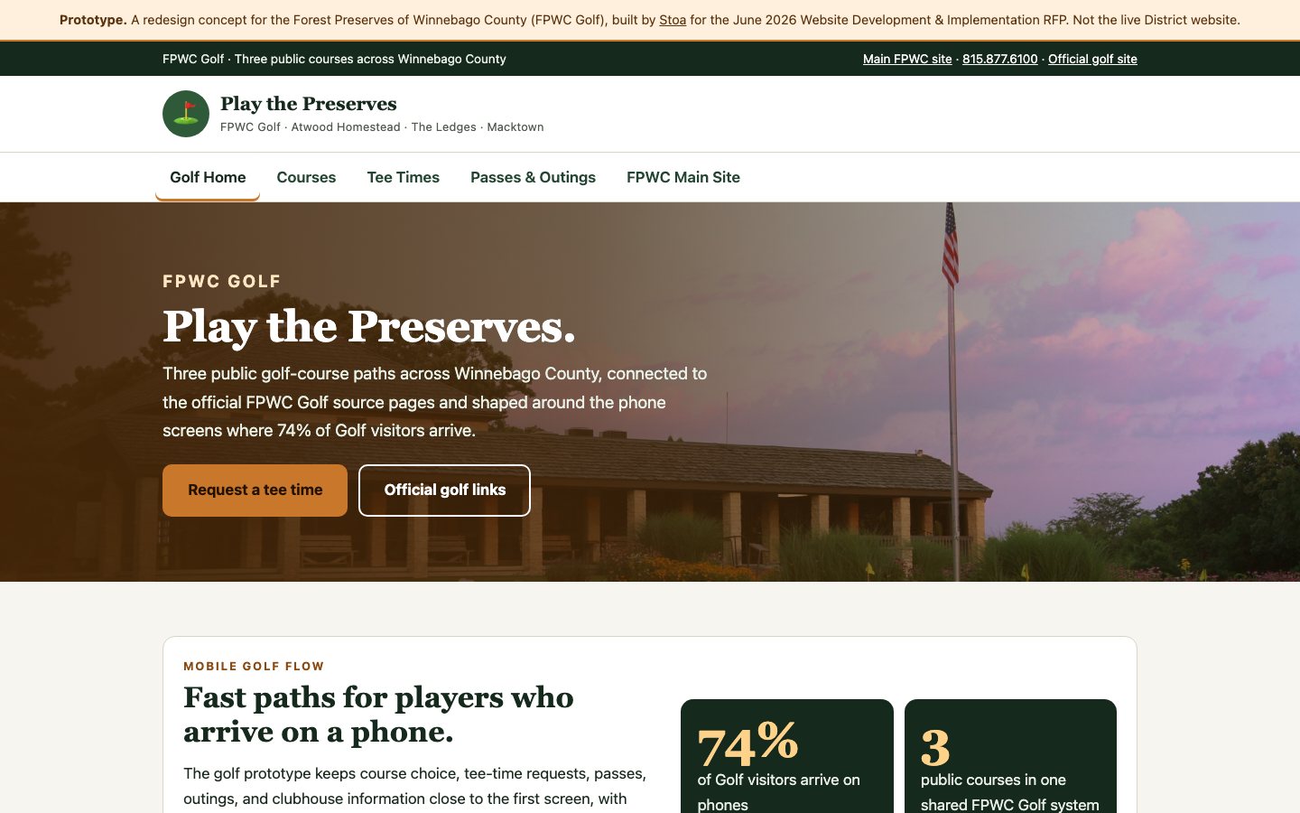
A golf microsite split out from its parent district site, because 74% of golf visitors arrive on a phone and want something the main preserve site is not shaped to give them.
Redesign concept built for the June 2026 Website Development & Implementation RFP. Not the live District website.
- Golf website design
- Tee-time requests
- Season passes
- Mobile-first
- Microsite
Play the Preserves — open the working site
Case study overview
The problem
Golf inside a parks department is a different business with a different customer. Someone deciding between three public courses on a Saturday morning is not browsing preserves — they want a course, a tee time, and a price, in that order, on a phone, in under a minute. Folding that into the district's main navigation serves neither audience well.
The approach
The golf operation gets its own front door rather than a section. Course choice, tee-time requests, passes, outings, and clubhouse information all sit close to the first screen with large controls and short paths that make sense before anyone is at a desktop. Each of the three courses — Atwood Homestead, The Ledges, and Macktown — is allowed to carry its own character rather than being flattened into a uniform card set, while all three connect back to the official course pages and tee-time paths so the microsite routes demand rather than intercepting it.
The result
A single-page microsite covering three courses, tee-time requests, passes, and outings, linked back to the parent district site and to each official golf source page.
Have something similar in mind?
Need a civic tool with this shape?
Stoa designs and ships resident-facing tools, internal workflows, and public service interfaces that stay fast, legible, and accessible from day one.