Design study · Circuit court · Missouri
Court services, a few clicks away
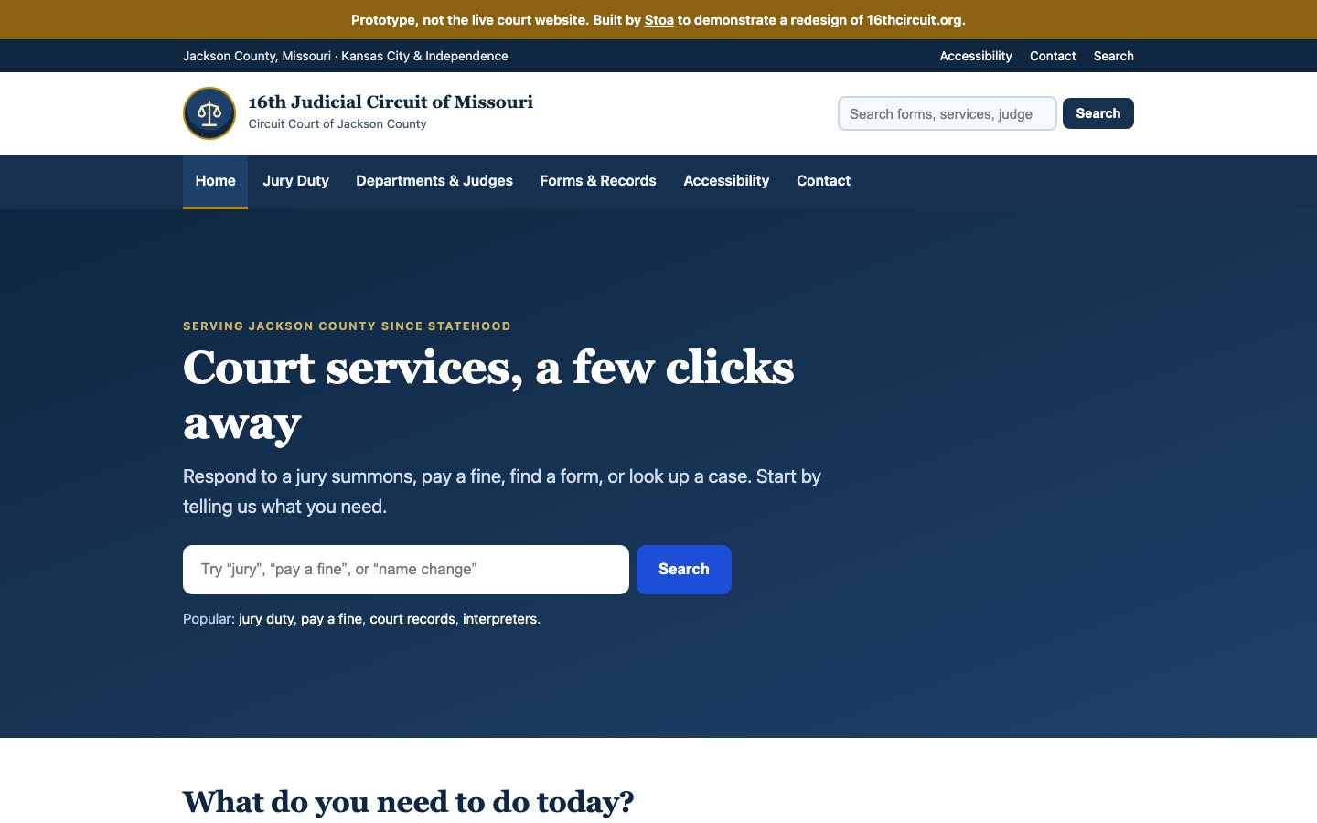
A redesign concept for one of Missouri's largest trial courts that keeps the existing information architecture intact and simply surfaces the six things residents actually come to do.
Prototype demonstrating a redesign of 16thcircuit.org. Not the live court website.
- Court website design
- Task-first navigation
- Case lookup
- Jury duty
- Keyboard accessible
- AA contrast
16th Judicial Circuit of Missouri — open the working site
Case study overview
The problem
A large trial court serving a county this size has genuinely high-volume, high-stakes citizen tasks — responding to a jury summons, paying a fine before a deadline, finding a form, checking a hearing date. Those tasks compete for attention with the institutional content a court also has to publish, and on most court sites the institutional content wins the homepage.
The approach
Rather than rebuild the information architecture, the concept keeps the existing six top-level sections intact and pulls the highest-traffic citizen actions to the front — a deliberate choice that makes the redesign adoptable rather than a migration project. Six task cards cover jury duty, paying a fine or fee, forms and fees, case lookup, departments and judges, and visiting a courthouse, each opening a focused plain-language page. Accessibility is treated as the design premise rather than a remediation pass: keyboard-first interaction, screen-reader structure, and AA contrast are stated commitments on the page.
The result
Seven routes covering jury duty, departments and judges, forms and records, search, accessibility, and contact, with a search-led homepage carrying the court's most-requested tasks.
Have something similar in mind?
Need a civic tool with this shape?
Stoa designs and ships resident-facing tools, internal workflows, and public service interfaces that stay fast, legible, and accessible from day one.