
Workshop Agenda item 6B
Designs for New Historic District Signage
City Council Workshop, Wednesday, February 4, 2026
Download these 9 pages, 4.1 MB Whole packet, 75 pages, 30.0 MB
Page 8
Text of page 8
To:
City of Saugatuck, City Council
From:
Grayson Moore, Director of Planning & Zoning
Meeting Date:
February 4, 2026
RE:
Historic District Sign Proposal
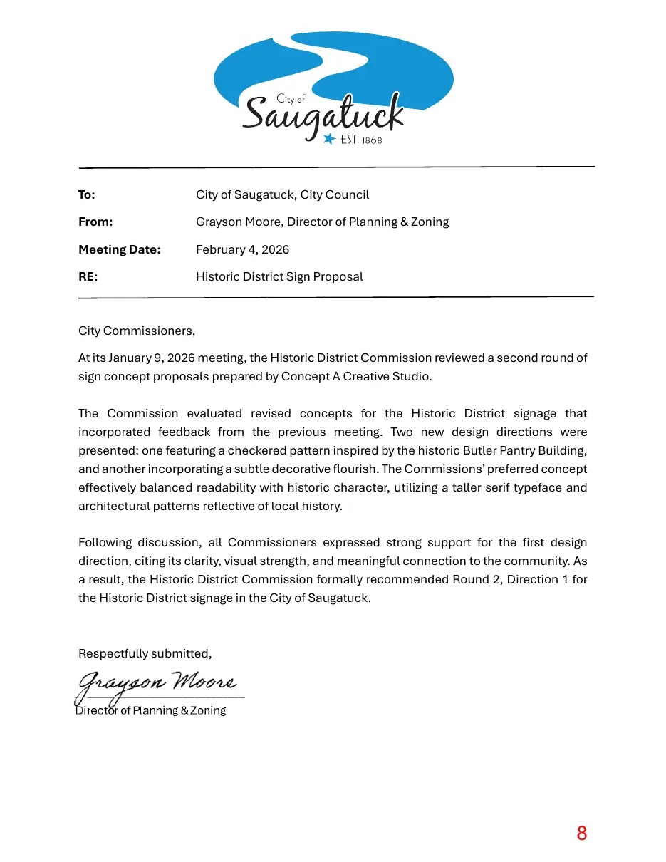
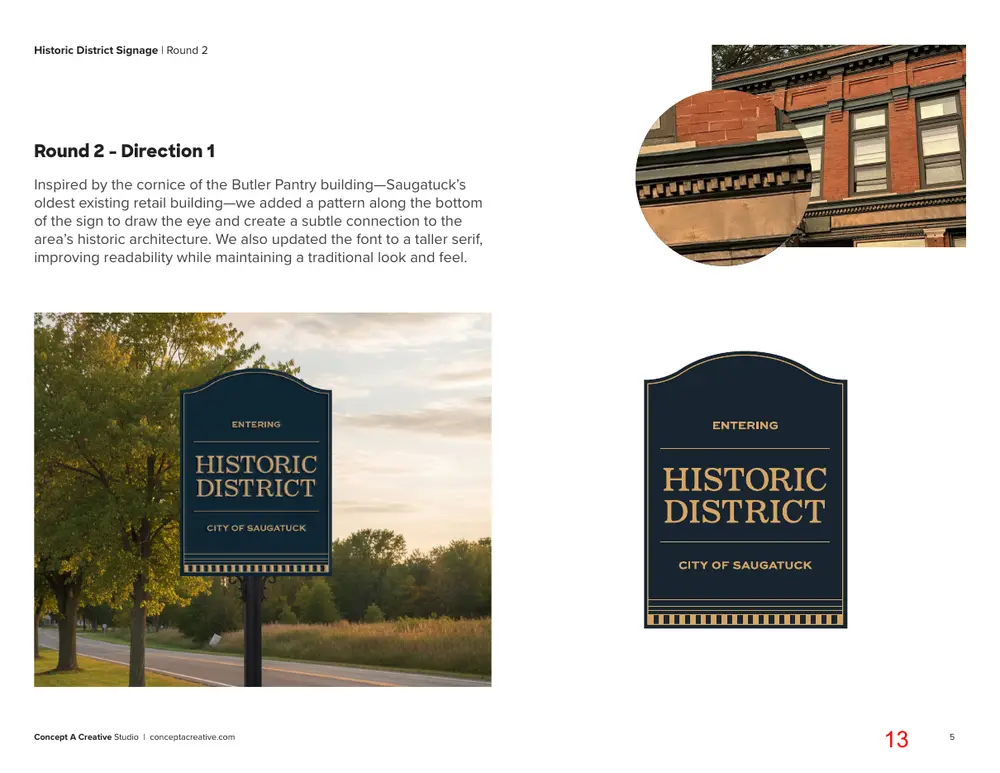
City Commissioners, At its January 9, 2026 meeting, the Historic District Commission reviewed a second round of sign concept proposals prepared by Concept A Creative Studio. The Commission evaluated revised concepts for the Historic District signage that incorporated feedback from the previous meeting. Two new design directions were presented: one featuring a checkered pattern inspired by the historic Butler Pantry Building, and another incorporating a subtle decorative flourish. The Commissions’ preferred concept effectively balanced readability with historic character, utilizing a taller serif typeface and architectural patterns reflective of local history. Following discussion, all Commissioners expressed strong support for the first design direction, citing its clarity, visual strength, and meaningful connection to the community. As a result, the Historic District Commission formally recommended Round 2, Direction 1 for the Historic District signage in the City of Saugatuck.
Respectfully submitted,
Page 9
Text of page 9
Saugatuck Historic District Signage Round 2 Concepts
Concept A Creative Studio | conceptacreative.com
Page 10
Text of page 10
Historic District Signage | Round 2
Brand Essence Should communicate the boundaries of the district and reason for celebrating it.
Fresh Celebratory Timeless Sense of Pride
Concept A Creative Studio | conceptacreative.com
Page 11
Text of page 11
Historic District Signage | Round 2
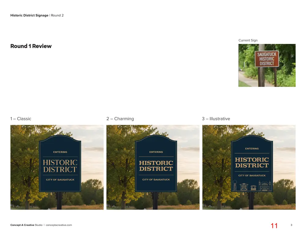
Current Sign
Round 1 Review
1 – Classic
Concept A Creative Studio | conceptacreative.com
2 – Charming
3 – Illustrative
Page 12
Text of page 12
Historic District Signage | Round 2
Round 1 Feedback 01. The font in Option 1 is highly readable but feels too modern. Option 2 has a charming, historic feel, but readability suffers. Takeaway: Explore a new font that balances clarity with a traditional aesthetic. 02. The weight of the illustrations in Option 3 at the bottom of the sign works well, but the illustrations feel overly branded and the icons too busy for this application. Takeaway: Find an alternative way to add personality and visual interest—something subtle and ownable to the Saugatuck area—without making it feel branded.
Concept A Creative Studio | conceptacreative.com
Page 13
Text of page 13
Historic District Signage | Round 2
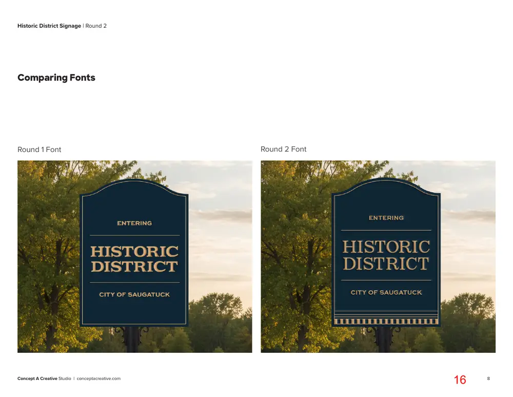
Round 2 - Direction 1 Inspired by the cornice of the Butler Pantry building—Saugatuck’s oldest existing retail building—we added a pattern along the bottom of the sign to draw the eye and create a subtle connection to the area’s historic architecture. We also updated the font to a taller serif, improving readability while maintaining a traditional look and feel.
Concept A Creative Studio | conceptacreative.com
Page 14
Text of page 14
Historic District Signage | Round 2
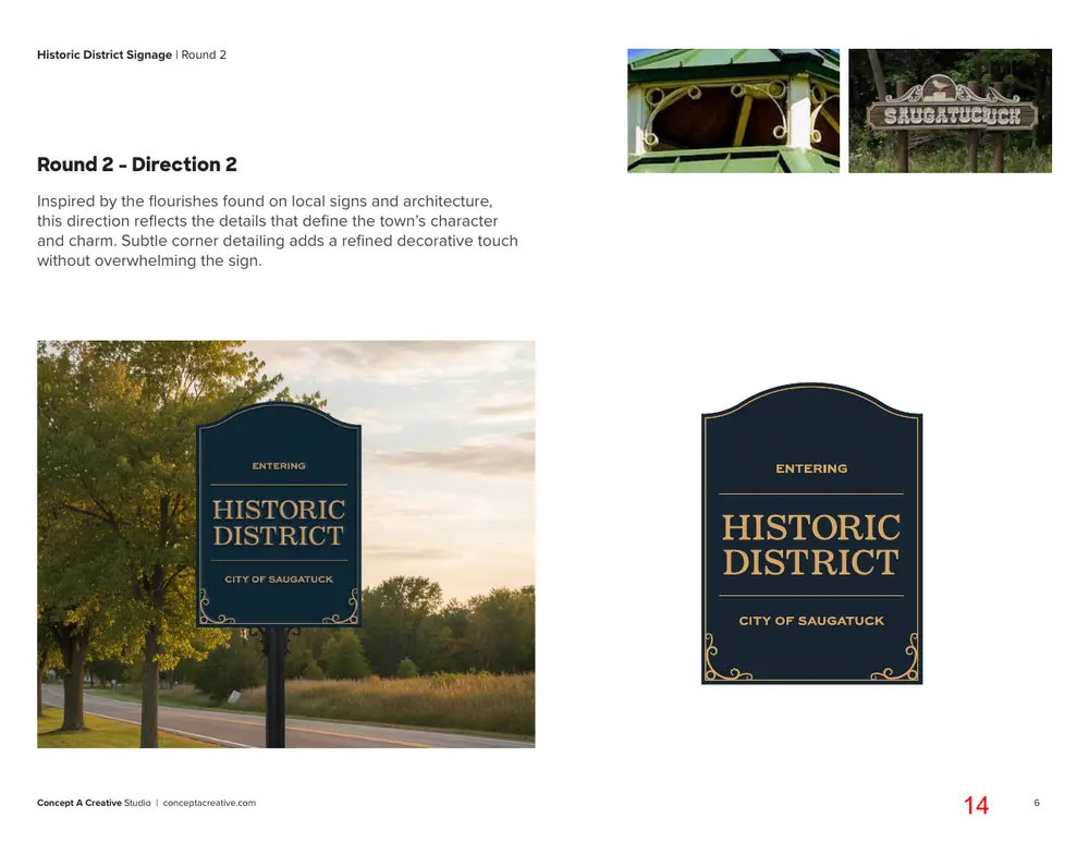
Round 2 - Direction 2 Inspired by the flourishes found on local signs and architecture, this direction reflects the details that define the town’s character and charm. Subtle corner detailing adds a refined decorative touch without overwhelming the sign.
Concept A Creative Studio | conceptacreative.com
Page 15
Text of page 15
Historic District Signage | Round 2
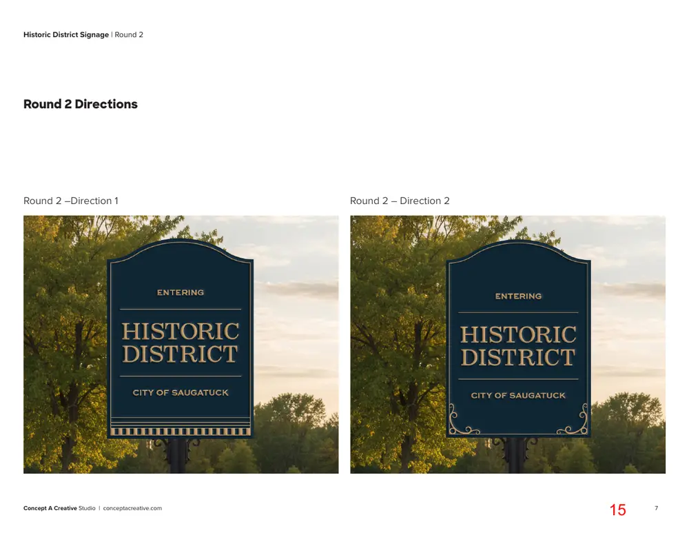
Round 2 Directions
Round 2 –Direction 1
Concept A Creative Studio | conceptacreative.com
Round 2 – Direction 2
Page 16
Text of page 16
Historic District Signage | Round 2
Comparing Fonts
Round 1 Font
Concept A Creative Studio | conceptacreative.com
Round 2 Font