The Oakland University Design System
Every button, card, form and layout on this site is a governed, reusable, accessible component — shown here working, with copy-paste code and content-governance guardrails. WCAG 2.1 AA built in
Color Tokens
--carillon
#100f12
--gold
#877148
--gold-bright
#ffcd00
--paper
#f7f3e9
--oak
#3c4a2e
--ink
#1b1a17
Typography
Spectral 600
Designed for bold, confident headlines
Libre Franklin
The system interface, body copy, and buttons
IBM Plex Mono
For code snippets, tokens, and governance docs
Space & Sizing Tokens
--sp-4
1rem (16px) — baseline unit
--sp-5
1.5rem (24px)
--sp-6
2rem (32px) — section spacing
--r-1
6px (card + button corners)
--r-2
10px (card corners)
--sh-2
Lifted shadow — used on hover
Buttons
<button class="btn btn--primary">Primary CTA</button>
<button class="btn btn--ink">Secondary</button>
Accessible because: buttons have min-height 48px (44px touch target + padding), meet AA contrast on all themes, and use semantic <button> elements with clear focus rings.
<!-- On .room--dark background -->
<button class="btn btn--primary">Primary</button>
Cards & Links
Computer Science
Bachelor's degree in computing, AI, and systems.
ServiceAdmissions
Apply for Summer, Fall, or Winter entry.
<a class="card card--link" href="#">
  <span class="cat">Program</span>
  <h3>Computer Science</h3>
  <p class="muted">…</p>
</a>
Accessible because: cards use semantic <a> links with adequate touch targets, text color meets AA contrast, and the entire card is a single clickable region with proper focus states.
Accordion
Oakland University maintains a 17:1 student-to-faculty ratio, enabling personalized instruction and mentorship across all programs.
Oakland University is the only public university in Michigan that charges no fees. Tuition is charged per credit hour with no added student fees.
<button class="acc-trigger" aria-expanded="false" aria-controls="panel-1">
  Question?
  <span class="chev"></span>
</button>
<div id="panel-1" class="acc-panel" hidden>Answer.</div>
Accessible because: accordion uses aria-expanded and aria-controls to announce state; triggers are keyboard-operable (Enter / Space to toggle); the chevron rotates to show visual state change; panels use semantic hidden attribute.
Form Fields
<div class="field">
  <label for="input-id">Label</label>
  <input id="input-id" type="text">
</div>
Accessible because: all inputs have associated labels (not placeholders); focus ring is visible and high-contrast; fields have min-height 48px for touch; error/hint text tied to fields via structure.
Announcement Component
Summer & Fall 2026
Apply now with no enrollment deposit and no registration deadline before fall classes begin.
<div class="announce">
  <span class="when">Applications Open</span>
  <div>
    <h3>Summer & Fall 2026</h3>
    <p>…</p>
  </div>
</div>
Accessible because: announcement uses a left border and semantic structure (span + div) to organize time and content; color is not the only indicator (border + layout); heading hierarchy is respected.
Grid Layout (3-Column Card Strip)
Grid Card 1
Responsive grid of program cards, news articles, or service links.
Grid Card 2
Flows to 2 columns on tablet, 1 column on mobile.
Grid Card 3
Each card is equal height and independently hoverable.
<div class="card-grid cols-3">
  <a class="card card--link">…</a>
  <a class="card card--link">…</a>
  <a class="card card--link">…</a>
</div>
Side-by-Side Layout (Image + Text)
Layout module
Side-by-Side + Arch Frame
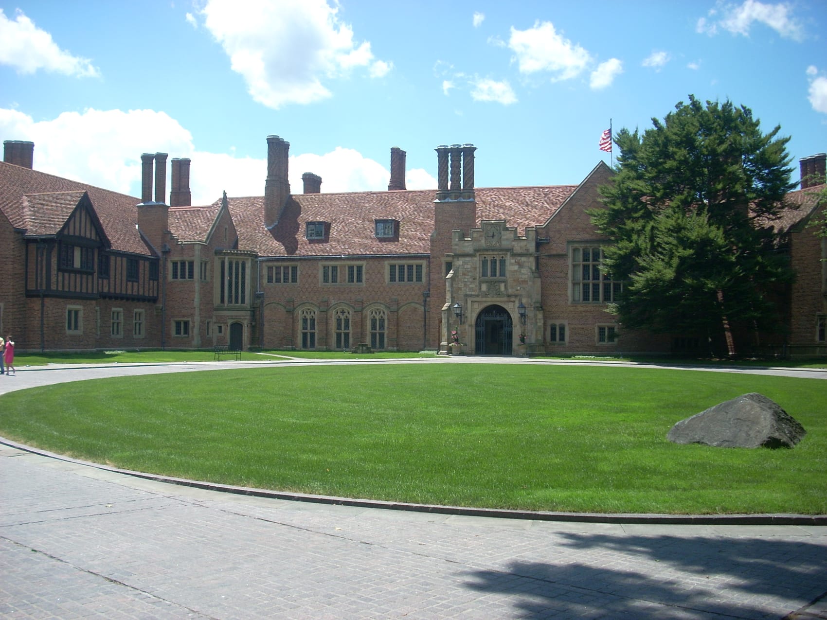
On tablet and up, image floats right next to text. On mobile, stacks vertically. The image uses the signature arched-top frame — a gentle collegiate curve that echoes Meadow Brook Hall.
<div class="split">
  <div class="split-body">…</div>
  <div class="split-media">
    <figure class="arch arch--wide">
      <img src="…" alt="…">
    </figure>
  </div>
</div>
Full-Width Feature Band
Layout module
Full-Width Dark Band
Used for calls-to-action, key messages, and contrast breaks. The dark room uses the Carillon black, warm gold accents, and a wide-column layout.
<section class="section room--dark">
  <div class="wrap center">
    <h2>Your message</h2>
    <p class="lede">…</p>
  </div>
</section>
Content Governance
These components are built as design tokens and reusable patterns that layer onto OU's existing TerminalFour CMS. The design system enforces consistency and accessibility across all OU web properties without requiring every editor to be a designer.
Governance Guardrails
- Component per page: editors select from a locked set of components (card grid, split, announcement, etc.) to build pages — one-off custom layouts are forbidden.
- Heading hierarchy: only one <h1> per page; h2, h3, h4 follow in order. No skipped levels. The system enforces this in the CMS editor.
- Color restrictions: body copy locked to ink color; CTAs locked to bright gold. No arbitrary color overrides. Editors choose from role-based options (primary, secondary, tertiary).
- Left-nav caps: primary navigation capped at 8–10 items; mega-menus prohibited. Role-first pathways (Future Student, Current Student, etc.) replace the kitchen sink.
- No unstyled lists: bullets must use the oak-leaf motif or the system lattice tick; plain <ul> not allowed in body content.
- Image alt text required: every image must have a meaningful alt attribute; the CMS enforces this before publish.
Next steps: These components are built as design tokens and reusable patterns that layer onto OU's existing TerminalFour CMS. During implementation, each component maps to a custom TerminalFour markup template; editors build pages by selecting components and filling content, not writing HTML. The design system lives alongside the CMS and updates the token values (color, spacing, typography) centrally — one change to --gold reflects everywhere it's used.