University Communications & Marketing
The Oakland Brand, Carried by the System
Oakland's brand and typography standards are being redeveloped. This page does not preempt that work: it shows how the design system already carries a brand, in color, type, the logo lockup, photography, and editorial voice, each built as a token rather than a fixed file. When the refreshed standards land, the system absorbs them in an afternoon, not a rebuild.
Brand foundations
The palette, for whoever stewards the brand
The same six colors that run this whole system, framed here for brand decisions rather than CSS. Each one is a token: change its value once, and every page already built on the system follows.
--carillon
#100f12
The dark room: Elliott Tower after hours, feature bands, the weight of a research university at night.
--gold
#877148
The signature accent. Borders, links, the oak-leaf motif: the constant thread between every light and dark room on the site.
--gold-bright
#ffcd00
Reserved for action: the one color that asks a visitor to click. Primary buttons and focus rings, nowhere else.
--paper
#f7f3e9
The paper every light room is built on. Warm, not clinical: a reading room, not a lobby.
--oak
#3c4a2e
A sparing secondary green for the wooded campus. Used lightly, the way 1,443 acres uses its trees: as a frame, not the whole view.
--ink
#1b1a17
Body text and structure. Warmer than pure black, easier to read at length.
Ready for the refreshed brand: every swatch above is a token, not a paint chip pinned to one page. When new colors are chosen, updating six token values updates every page already built on this system, at once, with no hunt through old files.
Typography as voice
Two typefaces, doing two different jobs
A brand's type choices are a voice choice. Oakland's system pairs a heritage serif for gravitas with a systematic grotesk for everyday wayfinding, so the same page can sound considered in a headline and stay easy to scan in a button.
For gravitas
Spectral
Unlock your potential.
The display and heading face. It carries the weight of a research university: headlines, page titles, the moments that need to read as considered, not clever.
For wayfinding
Libre Franklin
Find your program. Ask Oakland.
The interface face: navigation, buttons, forms, captions. Legible at speed, so a visitor can scan a page and act on it, not just admire it.
A third face, IBM Plex Mono, carries the system's data voice: labels, tokens, and the copy-paste code on the Design System page. It never appears in a headline or a sentence a visitor reads as prose.
Ready for the refreshed brand: Spectral and Libre Franklin are tokens too, not choices baked into every page by hand. When the redeveloped standards select new faces, updating those two token values updates every heading, button, and caption on the site at once.
Concept demonstration
One lockup, worn consistently everywhere
Official usage rules for the Oakland wordmark are being redeveloped by University Communications and Marketing. Until they publish, this section demonstrates the kind of guidance a governed system carries: the same lockup, with clear space, minimum size, and light-and-dark rules attached, as a concept rather than the university's adopted policy.


Do
- Keep clear space around the lockup at least equal to the mark's own height, on every side (concept minimum, shown above).
- Use the white lockup on the Carillon dark room and any photographic hero; use the full-color lockup everywhere else.
- Treat the wordmark and the grizzly swoosh as one lockup. They move together, or not at all.
Don't
- Stretch, skew, or recolor the wordmark to match a page's palette.
- Place the full-color lockup over a busy photograph without a scrim behind it; contrast has to hold at a glance.
- Shrink the lockup below the width used in this header, 150px, where the wordmark stops reading as text.
Concept note: the clear-space, minimum-size, and pairing rules above are illustrative, sized to demonstrate how logo guidance lives inside a governed system. Oakland's University Communications and Marketing team sets the adopted numbers when the brand standards refresh publishes; this system is built to hold whatever those numbers turn out to be.
Photography & imagery direction
Real places, real people, no stock feel
Three principles keep Oakland's photography honest to the place, rather than a generic backdrop any campus could claim.
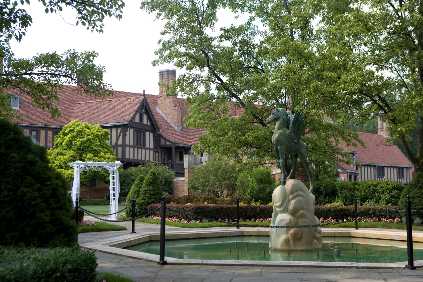
- Real Oakland places: Elliott Tower, Meadow Brook Hall, the pond and footbridge, not an unbranded generic quad.
- People first: students and faculty caught doing the work, not posed for a handshake.
- The arched frame: every full photograph on this site sits inside the collegiate arch, the site's signature treatment, never a plain rectangle crop.

Voice & editorial
Confident, scholarly, warm on the page
A research university speaks with calm authority. Warmth comes from word choice, not punctuation.
- Confident and scholarly: state facts plainly, the way a 17:1 ratio and no student fees speak for themselves.
- Warm through word choice, never punctuation: no exclamation points anywhere in the voice.
- Direct address: "Find your program," "Ask Oakland," not third-person institutional distance.
Prospective students who wish to be considered for admission are advised to complete and submit the application, along with all required supporting documentation, prior to the applicable deadline.
Thinking about Oakland? Here's what to send us, and by when.
Concept note: this rewrite pair is a concept demonstration, not a rule lifted from Oakland's actual style guide. It shows the kind of before-and-after a voice principle produces once someone writes the principle down and applies it consistently.
The other half of this brand
Built to be governed, not just designed
A brand is only as strong as the system that carries it every day. The Design System shows these same tokens and specimens working as real, accessible components. Governance shows how every editor keeps using them correctly, page after page, without a single off-brand button.
Learn more
Explore the live component library and tokens, or see how content governance keeps every page on standard.